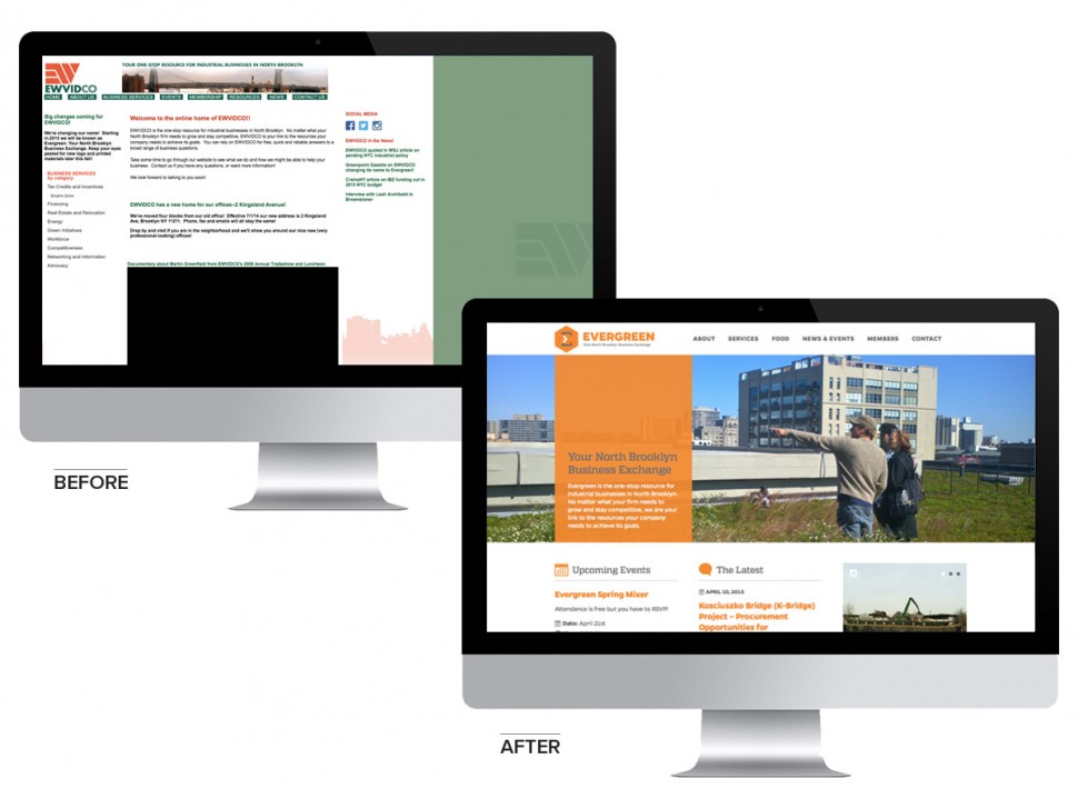
Evergreen: Your North Brooklyn Business Exchange is a one-stop resource for industrial businesses in North Brooklyn. The organization has supported manufacturing and industrial service businesses in the area since 1982. With their recent name change from EWVIDCO to Evergreen, the time had come for a rebrand. We jumped on the opportunity to work with a neighboring organization focused on revitalization and economic development right in our backyard.
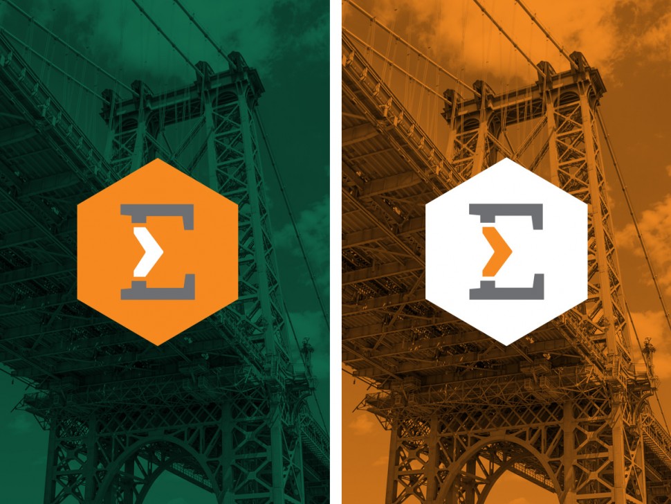
Working with the organization’s mission statement and its connection to the North Brooklyn’s rich history, we were inspired by the abstract shapes, strength and beauty in the support beams of the iconic Williamsburg Bridge. Our thought concept draws on the Williamsburg Bridge as an icon of strength, access, industry, support, history and connectivity, characteristics that define the foundation of the “E” icon in Evergreen’s new brand identity as well as the organization itself. As the chevron is commonly used to both direct users in web platforms and to guide drivers on road signage, our application of this shape strengthens the logo’s connection to technology and forward movement. The alternate logo version is in a crest that resembles a wrench socket, reinforcing the organization’s work with industrial and manufacturing businesses. Take a glimpse into our thought process on the MCo. Blog.
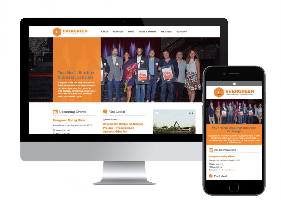
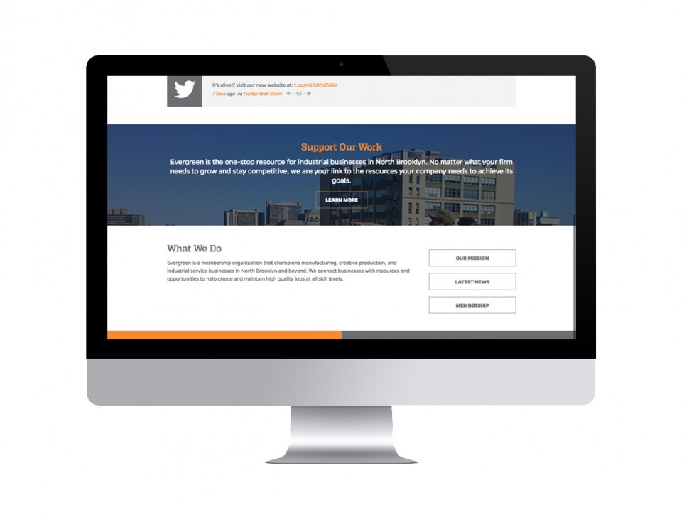
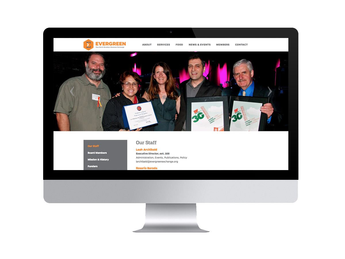
After building a thoughtful identity for the North Brooklyn business membership organization, we developed a brand new, fully responsive website for seamless interaction whether users are on a desktop computer, tablet, or mobile device. The website is complete with easy-to-navigate drop-down menus, integrated social media channels, a news and events calendar, and a CMS back-end to make updating user-friendly for their team members.
![]()
![]()