![]()
Evergreen: Your North Brooklyn Business Exchange is a one-stop resource for industrial businesses in North Brooklyn. The organization has supported manufacturing and industrial service businesses in the area since 1982. With their recent name change from EWVIDCO to Evergreen, the time had come for a rebrand. We jumped on the opportunity to work with a neighboring organization focused on revitalization and economic development right in our backyard.
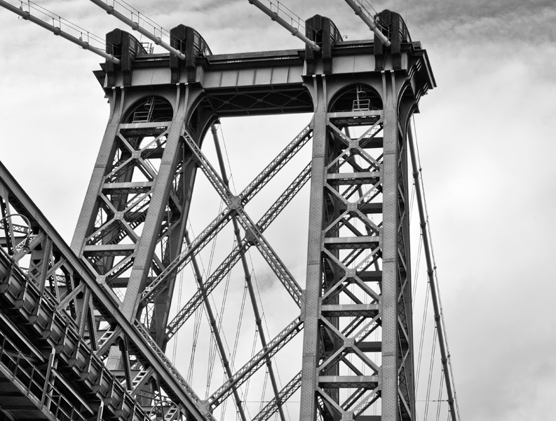
Working with the organization’s mission statement and its connection to the North Brooklyn’s rich history, we were inspired by the abstract shapes, strength and beauty in the support beams of the iconic Williamsburg Bridge. An “E” can be seen within the steel pattern of the beams, and by manipulating the letter in a slab-serif font, we created a direct relationship between the bridge and the area Evergreen serves. In the final icon, a chevron replaces the tie of the capital “E”.
![]()
Our thought concept draws on the Williamsburg Bridge as an icon of strength, access, industry, support, history and connectivity, characteristics that define the foundation of the “E” icon in Evergreen’s new brand identity as well as the organization itself. As the chevron is commonly used to both direct users in web platforms and to guide drivers on road signage, our application of this shape strengthens the logo’s connection to technology and forward movement. The alternate logo version is in a crest that resembles a wrench socket, reinforcing the organization’s work with industrial and manufacturing businesses.
We’re looking forward to this brand coming to life over the next couple weeks. The Board felt it was important to retain the original green used in the EWVIDCO logo, and we’ve been incorporating that into the brand as we move forward. A redesigned website, stationery and collateral materials will be coming soon, stay tuned for more!