![]()
The mission of the Greenpoint Chamber of Commerce is to unite and advocate for the varied businesses of North Brooklyn around the shared goal of improving the community’s commercial landscape and stimulating the local economy. They are dedicated to supporting local businesses by providing a platform to network, address issues of mutual convern and to market their products and services, leading to increased business for all members. With tremendous growth in the communities that the Chamber serves, there was also a need for an updated brand identity to better reflect the organization.
We began with a research phase that focused on collecting a list of iconic and memorable visual elements from Greenpoint, Williamsburg and Bushwick. We thought about what makes these areas unique, their history and their relationship with the Greenpoint Chamber of Commerce.
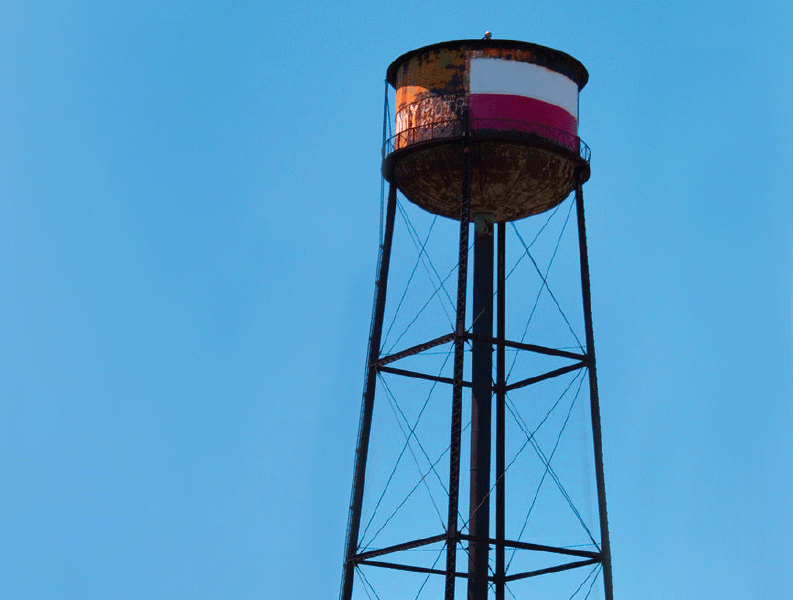
This water tower is one of the stand-out structures in Greenpoint, and it’s an icon of the neighborhood. Because the water tower is a common symbol of Brooklyn, we decided to look deeper into this icon, and we focused on its support cables that intersect and overlap one another. The intersection of these support cables creates a sense of movement, representing the diversity in these neighborhoods and the junction between businesses and the organization itself.
![]()
When these lines are placed over and cut out of a slab-serif capital letter G, an icon is created that speaks directly to the North Brooklyn neighborhoods. This area is dynamic, energetic and edgy with an incredibly rich history, and the icon embodies these common themes that carry through to the Chamber’s mission.
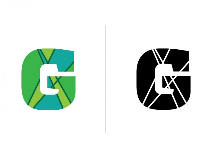
We’re excited to be a part of this local organization, and we’ll be rolling out supporting elements of the brand identity in the weeks to come. We originally developed this logo in shades of blue green to represent the variety of park space and the waterfront, as well as the color of the G train that serves the area. The result resembled what looked more like a map, but the client ultimately decided to go with a black and white version for their final logo. Stay tuned for more!