Camp Monroe is a traditional resident summer camp operating in Monroe, New York since 1941. The camp has a strong focus on sports and outdoor adventure activities, as well as creative arts and dramatics. With upcoming investments to improve many aspects of the camp facilities and programming, a need arose for an identity that would better reflect the atmosphere and quality of the Camp Monroe experience.
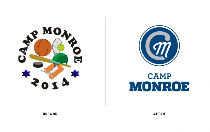
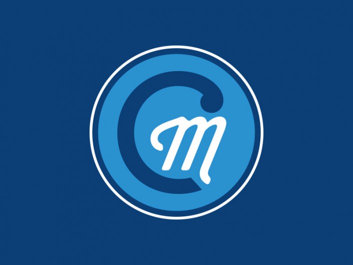
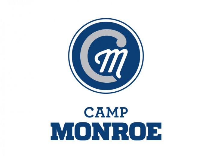
In developing a new identity for the camp, we were inspired by athletic monograms and collegiate typography. We spent time focusing on creating a logo that the campers would be excited to have on their camp apparel and enjoy wearing after camp session is over. It was important to maintain a traditional feel throughout the visual materials, as the camp maintains a strong connection to its roots. It was also essential to consider how the logo would be utilized once developed — camp signage, apparel, online media, marketing, printed stationery, promotional elements and more.
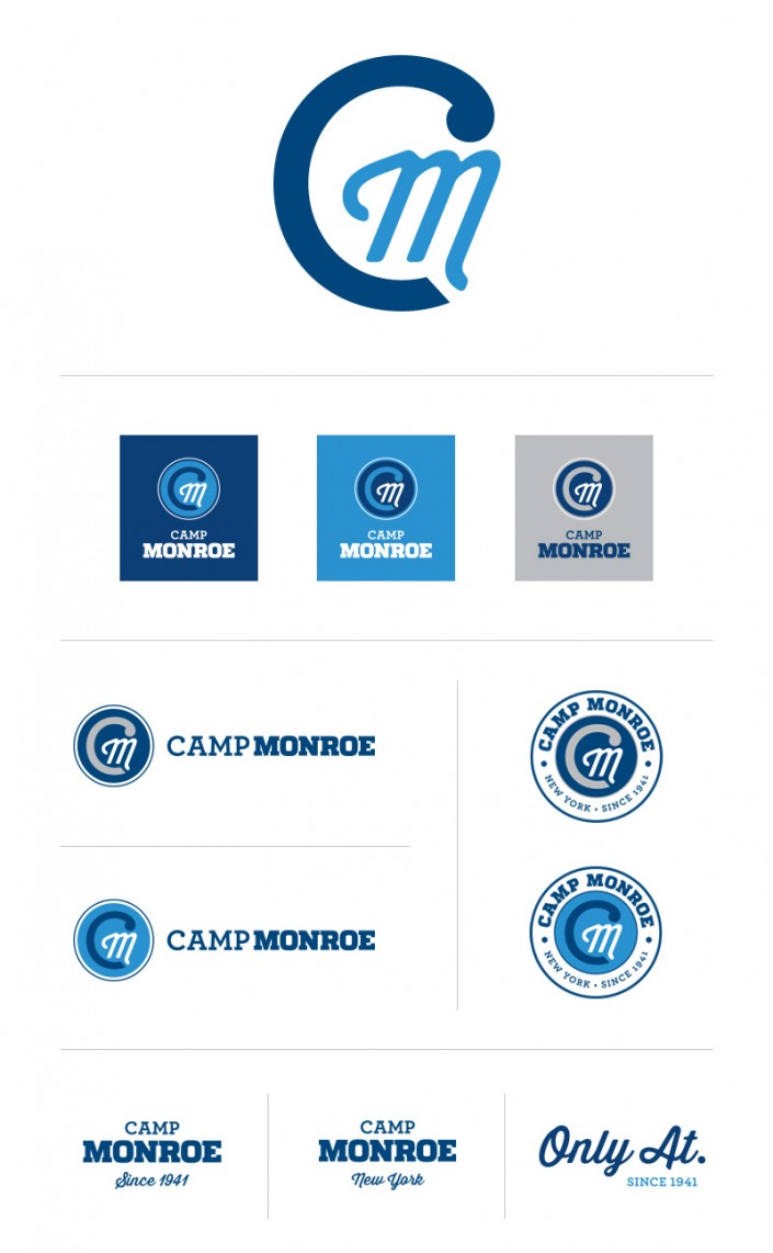
Through serif typography and a secondary brush script font, the identity feels classic and energetic. We merged a sense of heritage with a contemporary quality that gives Camp Monroe a bold visual identity in their transition moving forward. A welcoming navy, gray and bright blue color palette reinforced the sense of athletics and preserves a sense of timelessness. The versatility of the Camp Monroe identity really comes to life throughout the apparel and additional materials.
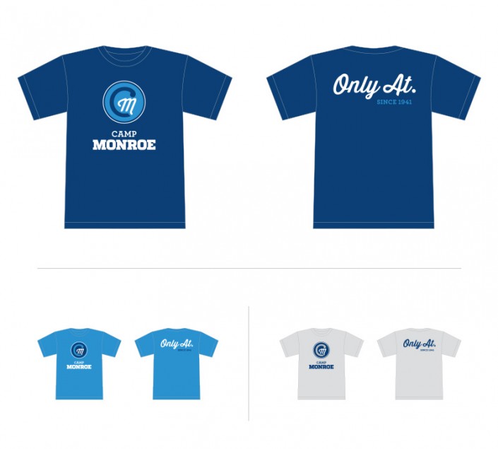
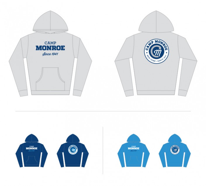
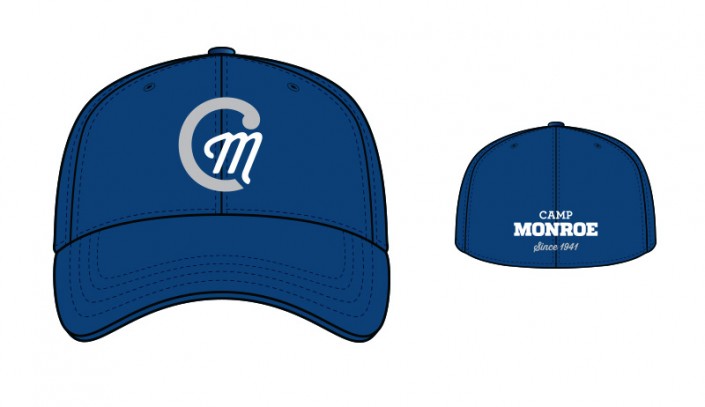
All of the apparel designs for the campers utilize the full color palette, with some incorporating the camp’s tagline, “Only At” and “Since 1941.” This further emphasizes the Camp Monroe history and tradition.
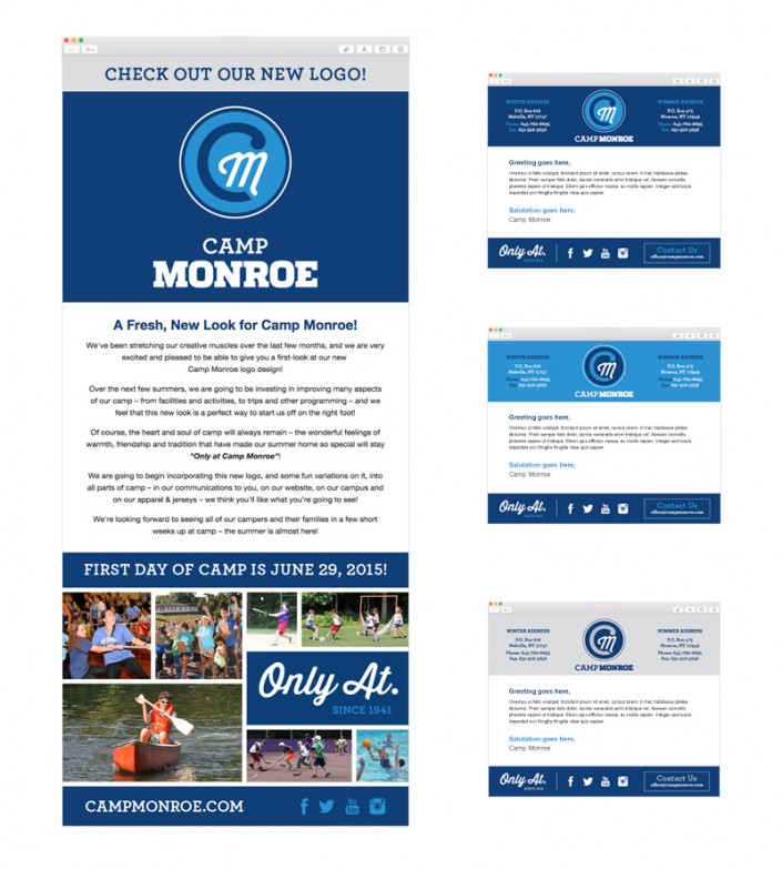
A beautiful email blast showcasing the new identity announced the new look and feel to the camp families. Additionally, we developed a family of email templates for Camp Monroe that takes advantage of the full color palette. The response thus far has been incredibly positive, and we’re very much looking forward to rolling out the remaining elements, including a brand new website! Stay tuned for more.