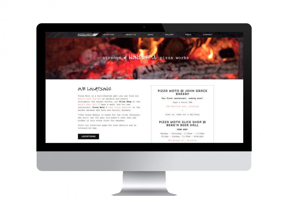
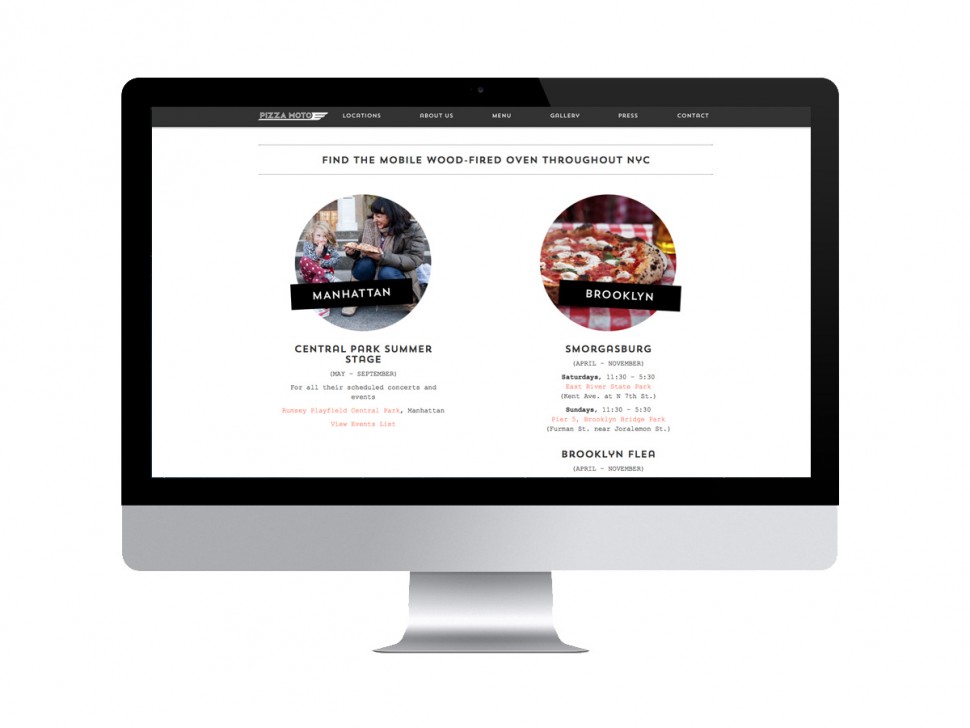
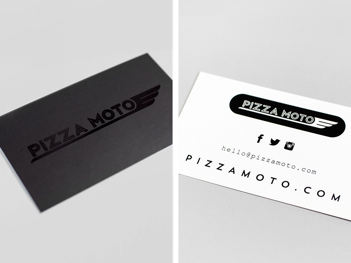
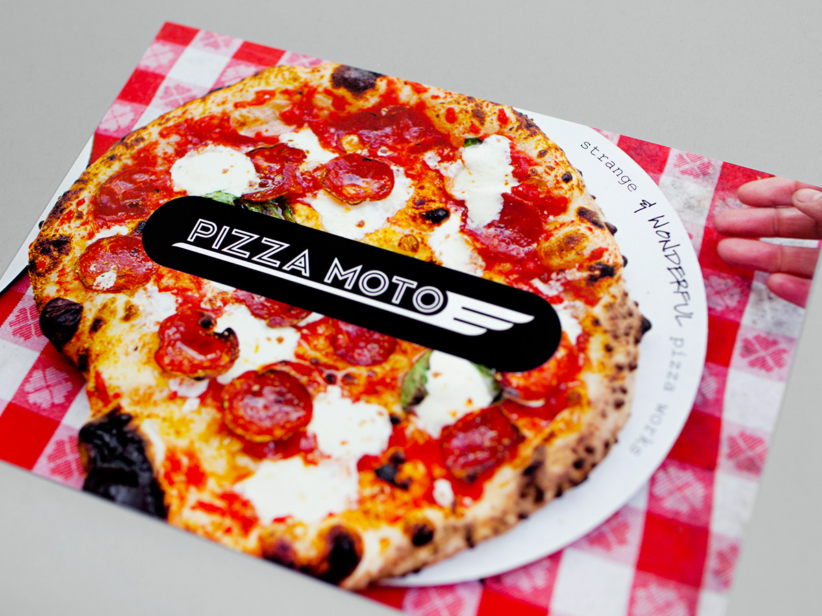
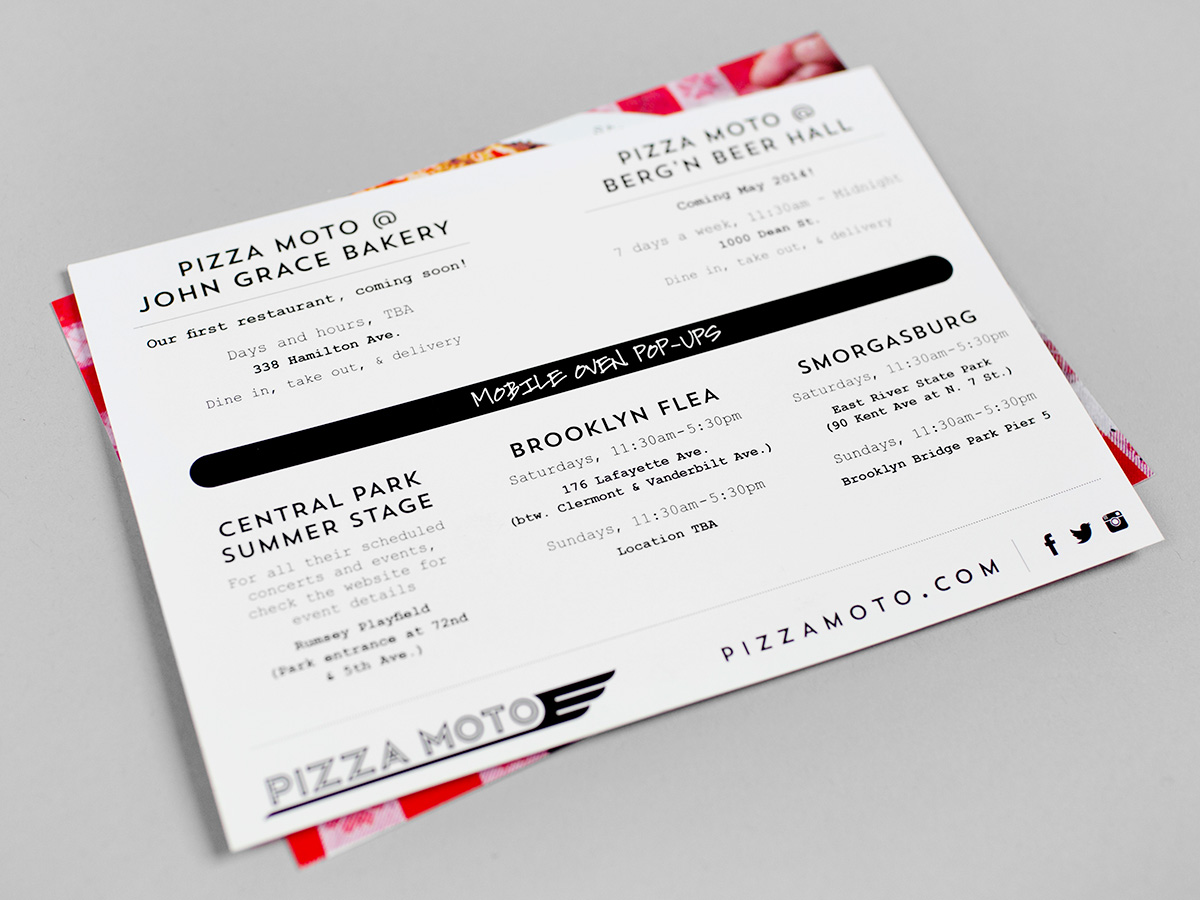
Pizza Moto cooks made-to-order, wood-fired pizza in one-of-a-kind mobile ovens at locations in Brooklyn and Manhattan between April and November. This season, Pizza Moto is opening their first brick-and-mortar location at John Grace Bakery in Red Hook. A version of their shop will also be found at Berg’n, Smorgasburg’s new beer hall in Crown Heights. We were so excited to help spread the word of their “strange and wonderful pizza works” by radically updating their website, as well as designing new business cards and print pieces.
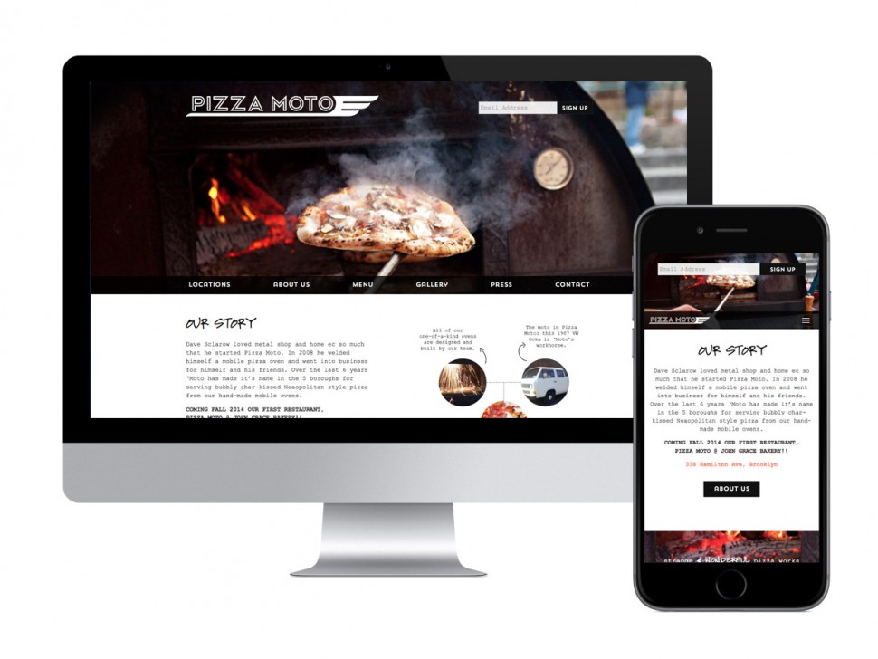
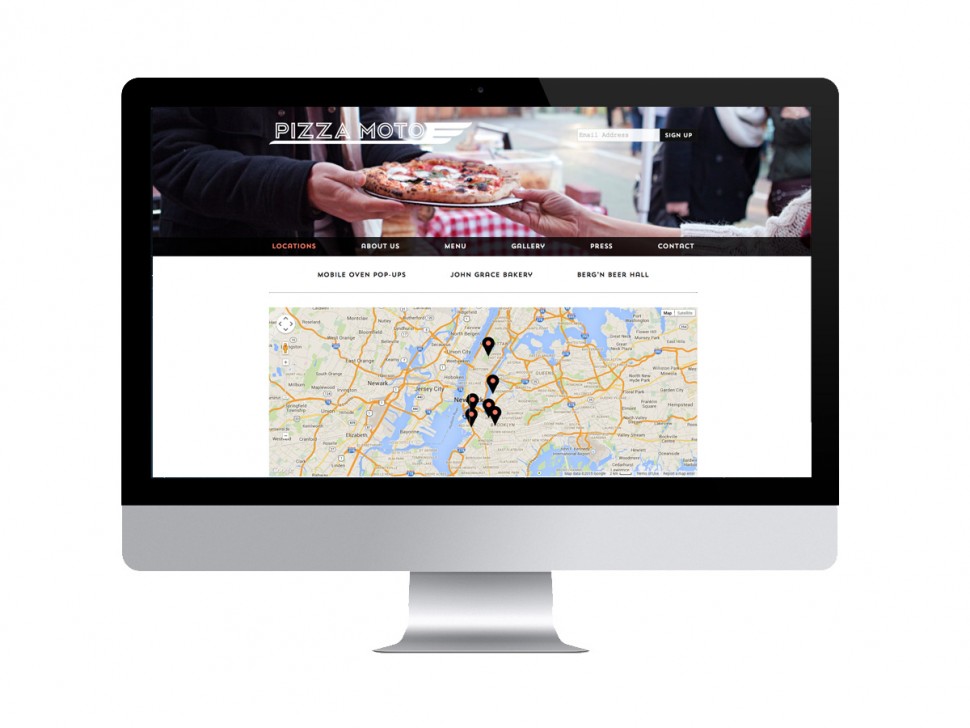
The website that we designed and developed prominently showcases Pizza Moto’s beautiful (and mouth-watering) photography through a responsive design with parallax scrolling. The new layout is clean, bold, and uses a black-and-white color scheme. We worked with their existing logo and chose a combination of typefaces with a DIY feel. Our site features a custom CMS, interactive map, menus for all of Pizza Moto’s locations, and photo galleries.
The full Pizza Moto website was developed to be responsive to cater to mobile phones and tablets. Pizza Moto’s mobile site includes helpful information, such as menus and locations, for users on the go.
As the old saying goes, “a business with no sign is a sign of no business.” McMillian Co understands the great significance of branding, messaging, and presentation to a business, and how to generate the often mysterious tools it takes to navigate this side of development. PizzaMoto looked far and wide for a team of designers and tech savvy tastemakers to help us define our brand, generate all our technical tools, and spread our message. We are a small company with only two operating owners, venturing into the world of restaurant ownership for the first time – Lindsay, Sebastian, Shaylyn, and William took our growing business seriously and built us gorgeous tools to make our mark in a crowded field. They had an intuitive understanding of how we wanted to present ourselves, made the creative and revision process fun, and welcomed us into their office with warmth and excitement for what we are working on. Their space in the Navy Yard is infused with a natural sense of competance, ease, and expertise, while simultaneously situating itself on the frontier of Brooklyn working communities. The final product they created for us was a website that excentuated the finer points of our somewhat complex story, business structure, and message about our future. They celebrated the esoteric nature of our venture, while crafting a presentation that made us accessible and easy to locate. They also guided us through the difficult process of fine tuning our logo, color palette, and branding as we took them on a somewhat hair brained ride of changing our minds and exploring our options. We were guided expertly to a simple, striking, gorgeous articulation of our style and culture – true to the new vibe we were seeking and the original elements our loyal customer base recognize and look for. We feel sure we made the right choice in picking our partners for this potentially arduous and very personal task. We’re glad to call them partners and friends as we grow and for all our future ventures.
Our team is thrilled about the way this project came together. Be sure to check out pizzamoto.com, and taste what Pizza Moto is cooking up at their New York City locations this season!