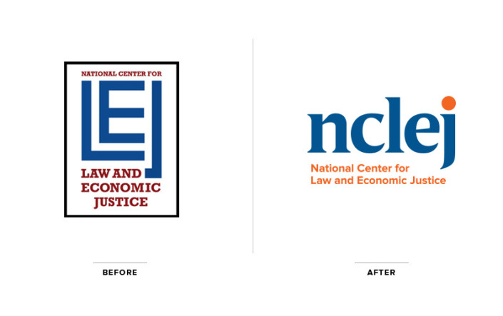
We recently had the opportunity to create an updated identity for NCLEJ, the National Center for Law and Economic Justice. NCLEJ serves low-income families, individuals, and communities by advancing the cause of economic justice through ground-breaking, successful litigation and policy work around the country. In working with such an honorable organization, we were eager to create a timeless, typographic lockup that portrays the seriousness of their advocacy work, but includes a sense of approachability and friendliness.

Our research circled mainly around organizations involved in justice, advocacy, equality and policy reform in our country. Since an icon can be misinterpreted and has the potential to portray a more narrowed vision, it became clear early on that a simple typographic lockup would be the most effective visual representation for NCLEJ.
Using a contemporary, bold, serif font in all lowercase, we achieved an authoritative, yet inviting look and feel. The lowercase lettering offers a sense of kindness, while the bold serif font is classic and traditional, with unique characteristics that give it added charisma. Rendering the glyph above the “j” in orange supplemented the identity’s friendliness and approachability. This can also be interoperated as a sun or glowing moon, which both have positive significance and hold an element of hope, confidence and aspiration.

The blue and orange color palette is a refreshed version of their old colors, showing a sense of respect for the past, though the new colors are more saturated and full of life — NCLEJ is visually moving forward a bit bolder, with confidence.

The main objectives of the new identity was to lead the organization into the future, all the while displaying an amiable, authentic and dependable look and feel that aligns with their tagline; “Fighting for Fairness for People in Need.”
We’re looking forward to carrying their new identity through to a brand new, user-friendly website built on a CMS platform. Stay tuned!